At the optometrist’s again — has it been a year already? — and I’m choosing: A or B? One lens, on my left, eye, makes the eye chart clearer, but the other lens makes the letters larger. Which is better? I make a call as best I can, then she switches out lens A for lens C and we go again.
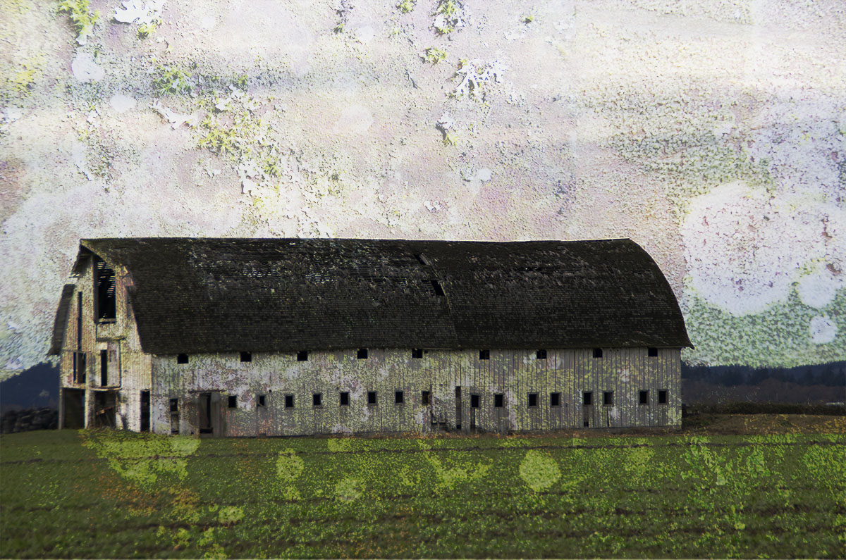
The same thing happens when I’m choosing between layer blending modes in Photoshop. Should I use Overlay or Luminosity, Darker Color or Linear Burn? All have their good points, and, they’re more fun to choose than a new eye prescription. There are many more options than just A or B when it comes to combining layers, but today, it felt helpful to narrow my choices down to two at a time. Here’s a walk through my thought process, starting with a base photograph, of a Skagit valley barn, and a compound of lichen photographs.


I always start with a texture photo on top of the base, using just a Normal blending mode — the actual photo is laid overtop as is. But what I’m looking for is a percentage of overlay that improves the original image. It’s usually between 25% and 75%; in this case, 50% looked like the right amount of lichen to add to the barn, below, to get my starting point. Drag to see if you agree. Yep, getting better already.

Now, to compare that starting point, Normal, to a different blend, Color Burn. Which is better, A or B?
In this case, I like B much better: more contrast & drama. Just like at the eye exam, I don’t worry as much about what the mode is called, or what it’s doing; I’m just focusing on preferences. Now, B or C?

Ooh, in this case, C does look better. A little brighter, but retains the mood & contrast. Okay, what about C or D?

Well, hmmm. D is moody, but loses some of the warm color I love. Pin Light is still winning. One more try: C or E?

Ding, ding, ding! We have a winner. Bright, textured, and yet ancient looking, a good start to a work in progress.

Intrigued? I’m happy to recommend my optometrist. Oh, you mean the layers? Here’s more than you wanted to know about blending modes, thanks to Adobe’s help system. Have fun!
p.s. Here’s how this work ended up: Gloaming, part of my Familiar Territory series.
So much fun!